Tuesday, August 31, 2010

Day Two: A 2-Color Day

     With the under-painting finished, we move on. We’ll now start to build some form with our next layers.


     By working with only two colors, we will simplify the process.  (Remember, some of the Great Masters used only 2-4 colors to great effect and they would render a completed, finished work).  We will be using one puddle of Raw Umber and another of Burnt Sienna.  Some parts of the painting will lean more toward the Burnt Sienna side, while others toward the Raw Umber side.  The photo above shows my work at about halfway through the process.  I did most of this work wet-on-dry.  Take your time and slowly build these areas.


     This photo shows the completion of the first major layer.  The majority of the work was done with a mixture of 90% Burnt Sienna and 10% Raw Umber.  Notice how I’ve sculpted the form of muscle groups using this simple mixture.  The painting is starting to develop fast, now that we’ve added this layer.
     That’s it for today.  Just enjoy the process, and we’ll see you tomorrow.  


All content and images © Mark Kohler Studio.  

Monday, August 30, 2010

Day One - "A Full Twist"


     In executing this painting, it may feel like we are starting off slow, but I promise we will accelerate rather quickly.  Since our color palette is rather narrow towards the end of the painting, we will be making corrections that may be hard to see due to the limitations of working with a photo via my blog.  We’ll be making small tweaks, and you’ll just have to trust me that this process will benefit your painting.  So do the best you can with the limitations we’re working under.


     This is my drawing, ready to go.  You can see I’ve taken my favorite grey mixture of Ultramarine Blue and Burnt Umber and established some early darks.  These aren’t washes, rather they lean more toward rendering with paint.  I like to re-establish parts of my drawing early on.  I’ve added darks into the eye, nostril and various areas of the head.  I try not to get carried away “re-rendering” with paint, but I’m more confident with the features already coming to life.


     Now, I’ve laid in a clear water wash over the face.  I let this wash dry a bit (where the sheen just starts to fade).  Then I applied a grey mixture of Ultramarine Blue and Burnt Umber, wet into wet, to define the brindle markings of the face.  I also define other areas including the neck, the brisket and front legs.  Let this dry naturally and completely.


     I want to establish an under-painting of the umber color of the steer.  This wash should be kept light (as least as light in value as the lightest part of the cow that isn’t white).  I know it sounds confusing.  Just study my photo and aim for that value.  We are again at the whim of “demo by blog”, but we’ll get through it.
     Tomorrow we start building washes and layers, now that we’ve got our under-painting established.

All content and images © Mark Kohler Studio.  

Saturday, August 28, 2010

Arizona Blue


B.J. has transcended being a mere subject, and has become my close friend.  The more sensitive of the Wachob brothers, B.J. is laid back and pensive, while his younger brother Kacey is the fireball and throws the punch you’ll never see comin’.  It’s rare to see B.J. agitated, but something about Arizona touches a nerve.  From the time he arrives, he talks of leaving… cedar trees and rocks are his bane.  And it’s a long slow burn until he washes Arizona from his boots.  

Friday, August 27, 2010

Watercolor Demo #2: " A Full Twist"


     Today’s post will be a short one.  I wanted to prepare those who would like to paint along with me.  I’m going to paint a small Longhorn steer vignette.  My finished painting image will be 12 x 9.   I will begin this painting completely drawn and move along faster than our first painting of Walter.
     I am posting my photo and palette that I will be using to work from.  I picked this photo because it will require a somewhat limited palette, and should make things a little less complicated.

     Here are the colors we will be using:
            Ultramarine Blue
            Alizarin Crimson
            Burnt Sienna
            Raw Umber
            Burnt Umber
            Cadmium Orange
            Cadmium Red

     My brushes will be Silver Black Velvet Rounds, sizes #4, #6 and #8.


     Here’s the photo I will be working from.  I made it a bit smaller, so it will fit on an 8.5 x 11 sheet.
     I know this was a short post, but I wanted to give the paint-along crowd a few days to nail down a good drawing. 
     Tomorrow, enjoy the weekend cowboy post of “Arizona Blue”.  And we will get together again on Monday and begin our painting.

All content and images © Mark Kohler Studio.
   

Thursday, August 26, 2010

Tell Your Story -- Then Tell 'Em What You Told 'Em


     Here we are at the final step of the “trifecta” of supporting players.  We got here by discussing what I feel are the three most important elements that must integrate seamlessly with your primary goal:  the best presentation of your piece of art.  We’ve discussed signature placement, frame selection and we are now at the most important of all the supporting actors, the Story.
     Right up front, I will admit that for some art styles, this may not apply, and it might not be for every artist.  But hear me out and maybe just give this one a try.
     Let’s assume your painting, itself, does some story telling.  Most figurative western art falls into this category.  Even most landscapes take us to a place where we inquisitively and instinctively want to know more about the location, time period, meaning to the artist, etc.  I like to take this a step further and give the viewer even more information.
     When I display my paintings I provide a paragraph long story with more information about the painting.  This initially was born of collectors and appreciators asking general questions about my subjects and me.
     It seemed at every show I would spend my entire day telling and retelling stories of my subjects and the behind-the-scenes drama of the painting.  I realized very quickly that I needed stories of these remarkable subjects beside each painting, if for no other reason than keeping up in a rush of people coming into my booth was frustrating to both me and the collector who wants to connect with the artist.
     Yes, it creates extra work before each show.  It takes quite a while to pen 20 stories and print them out, mount them on foam board, and finally attach a Velcro strip for hanging.  But you know what?  The stories next to my paintings are the single best marketing person in my booth.  They tell the truth behind each piece in a narrative that creates emotion.  A painting has the ability to generate plenty of emotion, and collectors connect to paintings in an emotional way.
     Art collectors hunger for a connection to a good painting.  No story is going to inspire a collector to move on a weak piece, but a quality painting with a well-written narrative can transport your art collector into your world.
     I love painting my subjects, but what I’ve come to learn is I am really a storyteller.  I love getting the story of my subjects out to the collectors through my piece of art and my words.  That is what really inspires me.  The painting introduces my subjects and shows the collector what they do, but the narrative tells them why. 
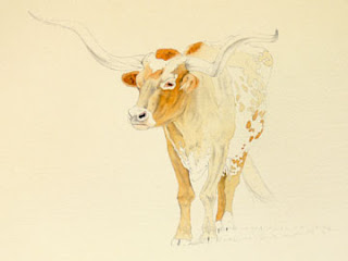
     I would like to demonstrate the power of the artist’s written word when combined with a special painting.  The painting’s title is “Behind My Rope, I Find Myself”.

Behind My Rope, I Find Myself
     Now here is the story on this painting.  See if you can imagine how the art collect might see this painting in an entirely different and new manner.

     Shane Thompson has a reputation as a gifted hand with both rope and horse.  When I first heard of Shane, he was working in Arizona.   I made it my goal to paint him, and during my travels to that state, I had the misfortune of missing him by one day.   But I persisted, and finally had the privilege of meeting him on the Old C.V. Ranch, outside Prescott, Arizona.  His initial demeanor is respectful, and Shane plays it cool, even reserved, when you first meet him.   But once you break the ice, he’s warm and loyal.  I have had the opportunity of photographing him for several years now, and am proud to call him “friend.”  Shane is the epitome of a dedicated, hard worker and he’s known for being levelheaded and calm.  He has great aspirations for his family and future, and is now the Cow Boss and Manager of the Triangle K Ranch, outside Willard, New Mexico.  If you really want to know Shane Thompson, all you have to do is witness him on horseback, rope in hand, and posting across the desert floor.  That’s when it all comes into focus.
        
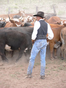
     Here’s another painting, titled “Fresh Shirt and A Fast Horse”.

Fresh Shirt and A Fast Horse
      Sometimes I think Shawn Goemmer doesn’t get it.  The cow business has such few perks to offer.  What you do get is bad weather, bad horses and bad markets.  But he continues to bravely march on.  Shawn is direct and plainspoken, and pulls no punches … not with townies, colts, cowhands, cow bosses or cow dogs …. Not to mention the hard country Arizona offers him.  I try to paint Shawn’s true demeanor.  He carries himself with buckets full of confidence, and I’ve come to realize that this confidence comes from the comfort he finds from following his true passion.  He exudes what it means to be a cowman.  The hard days string together with thankless work, and Shawn takes them in stride.  Every day starts with a “fresh shirt and a fast horse.”

     I understand this may not work for everyone, but if you can find a way to allow your collector to understand more about what inspires you and how passionate you are about your subject(s), as well as give them the behind-the-scenes story and life of your subject matter…. Well, then the sky is the limit.
     The War of Art is a tough road with loads of competition.  But it’s what you were made to do.  Take every little advantage to speak to your collect.  This use of the narrative is “advantage” at work.  Try it. You won’t be disappointed.

**Oh by the way, my blog for Friday will lay out my demo planned for next week.  I’ll give you all the details tomorrow.

All content and images © Mark Kohler Studio.


Wednesday, August 25, 2010

The Lasting Impression, Or, The Second Supporting Actor


     Framing is the bane of many an artist.  Just last week you probably heard me whining on Facebook about how hot my frameshop was.  The truth is a frameshop is a good problem to have.  I want to give you my thoughts on framing, which can be profuse, if I let them get out of hand.
     So I’m going to keep it somewhat limited and pointed.  I’ve been framing my own work since Day One.  Chalk up another project that originated in my grandfather’s workshop.  That’s where my philosophy on framing was born.  My grandfather split the cost of a big DeWalt chop saw with me, and we were off and running.  Later, I would invest in a glasscutter, a matte cutter, a chopper, flat files, and an under-pinner; all the basics for building your own frames.
     It’s always frustrating to see an accomplished artist who has invested so much time and effort in a wonderful painting, and then framed this beautiful piece of art with some, pardon my language, “crap” from Chuck’s Antique Emporium, Frame Shop and Bar.  Part of me smugly smiles at the competition loading the gun that they are shooting their own foot with.
     It’s difficult to approach an artist you don’t know and tell them their painting is wonderful, but their framing is sabotaging them.  I’m telling you here and now….. please spend money on your framing!  Cutting corners at this stage will only turn off most art buyers.  The only people, who hate framing more than artists, are collectors.  There are always exceptions to the rule, but for the most part, framing your piece of art, is your responsibility.   Many experienced collectors can see past a bad frame job and grasp the value of the painting, and will choose to re-frame the piece in a suitable style.  But many don’t have the eye.  Why flirt with chance.
     So we’ve established that we need to set a high bar.  Where do we go from here?  Basically, we can go one of two directions:  professional framer or self-framing.  You’ll pay dearly for both.
     The professional costs more until you can afford your own equipment, so early on the cost is a wash.  And there are many artists who prefer to pay the professional and not cut into their painting time.  Others, like me, block off sufficient time in their schedule to complete their framing.

     If you decide to take the second path, the decision is not easy, and requires a little observation and research.  It requires the artist to visualize what his finished painting and frame should look like.  This is your job!  Now is not the time to delegate decisions to Chuck at the aforementioned Emporium.  If you don’t have a vision for your final product, then haul your creative butt down to a gallery now and start looking for possibilities.
     I’ve found that my framing tastes grow and transform as my skill and expectations grow.  I wanted wrapped mattes on some paintings, so I got a friend to teach me how to wrap mattes.  I also wanted to learn to gold leaf liner mattes, so I got a framing master to teach me leafing.  Framing can be a lot like painting—just keep adding skills to your artistic war chest.

     Clawing your way through this supplementary effort called framing can be as much work as producing your painting.  But the reality is this:  next to the actual painting, nothing can visually impact the collector, positively or negatively, as your framing. You must see yourself and your collector as a professional.   That is how the collector wants to see you, and if you proceed by doing your best to have a vision for your work, they will perceive you as that professional.
     If you don’t believe me, let’s go back to Stephen Pressfield and his book, The War of Art:
     Pg. 96:  A Professional Is Recognized By Other Professionals.  “The professional senses who has served his time and who hasn’t.  Like Alan Ladd and Jack Palance circling each other in Shane, a gun recognizes another gun."
All content © Mark Kohler Studio. 

Tuesday, August 24, 2010

Why Sign Your Artwork? Here Are 7 Things To Consider


      Today I will start a short series on the three supporting actors for your painting.  This small series doesn’t just benefit artists; it also provides value for collectors or future collectors.  Let’s consider the painting as the lead actor.  But I want to caution you that these supporting characters all have the ability to make or break your leading man (or woman).
     I’m going to start today with the most innocuous of the three.  But don’t discount the artist’s signature, as being less important.  Consider this scenario and see if it sounds plausible:  You’ve been gallery crawling most of the day in a small art town.  You know exactly what you’re looking for, but haven’t nailed down that special painting.  Mentally you are prepared to buy the right painting.
     From across the room a little 9 x 12 painting is screaming at you from the wall.  The painting has done its’ first work---it has grabbed you!  You lock onto the painting and start across the room.  Now comes the scrutiny.  The painting handiwork is remarkable; the value, color and subject matter all appeal to you.  This could be it!  This is it!  You motion to your spouse for validation, approval and common ground.  Then you wonder, who is the artist?  You scan the bottom of the piece. Whoa!  A third-grader signed this thing!  You can’t even remember the artist’s name because, well….it looks like a third- grader has signed this painting!  Surely this can’t be the same person!  Can I love this painting with that signature?  Doubt has just crept in.
     The truth is, this scenario does happen.  As artists, we are more attuned to this type of thing.  But don’t disregard the educated collector or the neophyte.  Everyone has an opinion.  Here’s why I think the final stroke is so important:

      1.  I DID THISFirst and foremost, the signature says you did the painting.  For the artist, it should signify a moment of accomplishment.  For the collector, it provides valuable information.  It says who you are; not only for today but also for 150 years from now.  The painting will change hands many times, even in the same family.  Let them know who you are.  There is empirical evidence that unsigned artwork loses value over time, compared to the same painting that is signed.

     2.  SIGN WITH YOUR MEDIUMIf you did your painting in watercolor, sign it in watercolor.  Nothing makes a work instantly questionable like a signature in another medium.  Don’t create questions of authenticity when you don’t need to.

     3.  INTEGRATE THE SIGNATUREWhether you think so or not, your signature becomes a part of the painting.  It must be considered as a design element.  Look at the painting and make a composition decision.  If you’re not sure, put your signature on a small piece of paper and move it to possible positions for evaluation.  It’s too late if you sign the wrong place, especially for us watercolor folks.  Also, I pre-build my frames, so nothing is more aggravating than realizing your signature is hidden by a matte or frame.

     4.  KEEP IT SUBTLE…OR MAKE IT BOLD!I usually keep my signature subtle.  I don’t want the size or color to compete with my painting.  So much of an artist’s job is to lead the viewer’s eye.  Why spend 3 days on the perfect painting, to put a bright orange signature that overwhelms your efforts?  I’ve seen it often.  With that said, bold signatures can work for some artists.  Think about Picassos bold stamp of a signature.  For the most part, it blended with his style. 

     5.  OVER TIME, YOUR SIGNATURE WILL BECOME YOUR BRANDI can recall many artists whose signature has become their brand:  Monet, W.F. Reese, and most recently Richard Schmid or Jeremy Lipking come to mind.  Branding is a powerful tool, and name recognition tied to your signature becomes an asset.

     6.  LEGIBLE OR ILLEGIBLE?  Many artists never stop to consider the importance of this aspect.  Generally speaking, I would suggest “legible” early in your career.  As your notoriety and fame grows, then you might loosen up a bit.  William Matthews’ signature is a good example.  Generally, his signature is a bold calligraphic statement, but most art collectors know in an instant whose signature it is.  He has built a very strong brand.

     7.  The final point is VALIDATION.   In many ways this is the most important.  Your signature says “I approve of the final effort”.  The finer things in this world have signatures.  Granfors Bruks makes the finest hand-forged axes in the world.  Guess what?  Each smith signs his work!  Your stamp of approval validates authenticity, quality, and quite frankly your artistic reputation.

     Stay tuned tomorrow for Part Two, and Good Luck!

All copy © Mark Kohler Studio.  


Monday, August 23, 2010

The Railroad Man: "It's All About The Quality"


I attribute my love of my craft to my grandfather, W.E. Beasley.  He is the single biggest influence on my love of all things “quality”.  He was a simple man with a great love for creating finer things.  Growing up with Paw was the stuff kids dream about.  I know he had a hard childhood, and I could never get him to tell me about it.  Maybe that's why he was so generous with me.
     Paw was a conductor on the Southern Pacific railroad and made his run from San Antonio to Llano, Texas, called the Llano Local.   This run ended in Llano, picking up large granite blocks, which were headed for the Coast to construct the jetties.  
     When he was gone, the world stood still.  But when his run ended, we headed for his shop.  The list of “creative boy projects” was too long to accomplish in its entirety, but we did manufacture some interesting things.  My job was to find and research projects I was interested in, and Paw would join right in and we’d start production.  Our projects included blowguns, crossbows, throwing knives and even a mini trebuchet (we found the plans for this Middle Ages weapon in Popular Mechanics.)  It was 1/8th scale and could throw an orange 3 lots over.  I had hours of fun with that venture.
     My grandfather briefly took up oil painting (self-taught), but I personally think he found it too slow-paced.  This is his final painting, which still hangs in my mother’s home.
     I mentioned the greatest single attribute my grandfather gave me was an appreciation of quality, and that standard was applied to his tools, as well.  Paw found Snap On and Craftsman tools were a must for our various adventures.  And his wood shop was full of Swiss and German hand tools.  If the saying “Jack of all trades and master of none” were true, it didn’t apply to my grandfather.  He was a true Renaissance Man and master of whatever project he took on. 
     Here’s just a small list of what he accomplished:  He sewed my mother’s Baptism dress. I know of at least 3 Model 98 Mausers he restocked.  During his woodcarving period, he made several wooden chains with a caged ball that rolled a full 4” inside its wooden cage (and all carved from a 36 inch 2 x 4).  He embraced ceramics, and my family has a treasured manger scene to remind us of this phase of his life. He was a master gardener and spectacular cook.  We would eat Sunday dinner after church at his house and the feast would include 3 or 4 meat dishes, 4 vegetables and at least 2 different desserts---every Sunday!   And his cheeseburgers and fries bordered on gourmet.  He was a passable seamstress (the aforementioned dress and several quilts attest to this skill).  In his later years, we both took up knife making, of the folding variety.  If it was something I was interested in, then he was all in!

     As I entered my adult years, we both focused more intensely and specifically.  I took up watercolor and drawing, and he turned his attentions to clock making and fiddles.  I would watch him tirelessly steam and bend very expensive veneers of fiddle back maple.  Many times the pressure would break the thin strips, but he would never become frazzled.
     I watched him for hours; painstakingly carve grooves for inlaying ivory, using hand tools and a perfeling knife.  His eye was always on the goal.  The tedious work never wore him down.  His persistence was legend.  He rebuilt the German works in my mother’s grandfather’s clock until it timed perfectly.
     In 1999 lung cancer showed up with a vengeance, and one short month later he was gone.  I never really said the things I wanted to say, but  he was the stoic, quiet type who would rather show his feelings than tell you, and I guess I followed in his footsteps.
     In one fell swoop, an idyllic and ongoing childhood ground to a halt.  My fallback partner for any challenge was gone and the time to fly on my own had come.  In the end, all we have are good memories and maybe the gifts we’ve received from those who came before us.  And I have both.  His expectations of me would be singular….”Do the best you can.”  It’s all about the quality.    

All content and images © Mark Kohler Studio.          

Saturday, August 21, 2010

Too Young To Be Pensive

Too Young To Be Pensive

I first met Chance during a trip to the Goemmer's Triangle K Ranch, outside Willard, New Mexico.  He was a young kid that came from a ranching family in Oklahoma, and yearned to be in the middle of everything. 
  This particular summer, I was at the C.V. Ranch near Paulden, Arizona and Chance showed up to once again work for the  Goemmer's.  This time for Lowell's son, Shawn.  Chance had the opportunity of a lifetime: to learn from some of the best cowboys I've ever seen; men who live by the code of the West; men that a young kid in search of  his destiny could emulate.  And learn he did!  A summer spent with the likes of Shawn Goemmer, Ben Kimble and Shane Thompson kicked him a long way down the cowboy road.
     In this painting, Chance is 16 years old, but his skills are as polished as any veteran cowhand.  I love this shot of him holding herd and waiting for his opportunity to rope and drag.  I especially like his reflective mood and I was thinking about what a melancholy moment this was.  Chance was, in all probability, contemplating his turn to pull his rope down and go to work.  I guess I was in awe that this kid could be so serious about his responsibilities.  Let’s face it, how many pensive 16-year-olds do you know?

All images and content © Mark Kohler Studio.

Friday, August 20, 2010

Sometimes You Just Have To Give It Away


     One of the great things about being an artist and selling my own work is that I can do what I want with it.  I only do a couple of shows where I set up a booth and sell directly to the public, but it has been my particular pleasure to have a small original painting that I intend to give away sometime during that show.
     I will tell you this:  sitting idle at an art show for 2 to 3 days can teach you some very interesting things. Here are just a few:
- Some dog people are stranger than cat people.
- Most people have an aunt “who paints a lot better than you”.
- Hot dog grease isn’t that easy to get off glass.
- And the comment that claims First Prize for Genius was the man who asked “So, who does the paintings for your wonderful frames?”  Yes, you read it correctly.  I just shook my head and chalked it up to Darwin.
A Christmas Carol by John Groth 
     But here is the upside to all the foolishness….there will always be one kid; one who stands out and who seems way too young to stare at a painting.  They will be completely mesmerized, not so much by the subject matter, but more by the technique.  They will be a kid who already has developed an appreciation for the subtleties in a painting that no one that age should be aware of.
     I love talking to these kids.  We have much in common. They draw incessantly.  I draw incessantly. We both love horses and cowboys and couldn’t stop if we wanted to.  Their parents always seem concerned, as if this “art thing” is (hopefully) just a passing fancy, or a minor affliction.  If only they knew.
     I feel compelled to tell them about the road that has been chosen.  I want to steer them away from discouraging their children.  I want to tell them, “Don’t teach it out of them”, and “Forget your dreams of Law School”, and finally “Focus on the Gift”.  If their children are anything like me, Algebra 1-4 will be a series of unsatisfactory report cards (all with the forged signature of my father), followed shortly by a low D or a high F.
Korean War by John Groth
     Kid gloves are a necessity for parents who have the sudden realization that they have a hopelessly focused artist on their hands.  This is where the painting comes in.  It’s a gracious gift given to a child who has an artist’s soul; it’s framed, it has a personal message from me to the child on the back of the painting, and it will do it’s magic for many moons.
     How do I know this painting will have so much influence?  That it will talk for me when I can’t?  That it will inspire and encourage?  And that it will set a high bar, and maybe provide a direction or a path?
     I know this because someone did it for me….a good man named John Groth.  He was staying at the Villa Capri Hotel in Austin, Texas (where my mom worked as a secretary for Guest Relations, and I spent many summers). Mr. Groth was a well-known book illustrator, and he took note of my artistic disposition.  The year was 1975, and with one drawing signed by him to me, he changed my path.  I had always been obsessed with drawing, but this was the first nudge that I got from a real professional.  And it made a difference.
     If you are reading this, no matter what your field is, you will have the opportunity to meet that kid; the one who wants to be a cowboy…or an artist….or writer….or is good with his hands.  He has a gift and he needs you.  Just give it away.


All images © John Groth.  All content © Mark Kohler Studio. 

Thursday, August 19, 2010

Carpe Diem! And If Not Now....When?

          
     Carpe Diem comes from a Latin poem by Horace.  The phrase is popularly translated as “Seize the Day”.  However, Horace used the word to mean “Enjoy and make use of”.  I like Horace’s original intent.
     I have many art friends who would do well to implement Horace’s advice to us all.  I don’t say this from a boastful attitude, because I know my weaknesses.  In college, I was not the most talented artist.  In fact, in most of my classes, I was usually darn near the middle or average.  But I learned one hard and fast rule that has served me well from then until now.  Carpe Diem, Brother!
     If you can’t “out-talent” the competition, you can darn sure outwork them.  Most of my college education in art consisted of foundational drawing and developing the persistency to stick with it until it was right.  Once I came to the realization that I was just going to have to work harder than the “gifted and talented” group, I was unstoppable.

     While they would rest on their proverbial laurels, I was working on my skill.  My senior year I came across an Ad man named Chris Hill, who taught an advanced Commercial Art class.  Chris Hill cemented Carpe Diem in my brain, pointed me toward the job market and basically said “Go outwork the competition.”
     I quickly grew weary of the type of people that float in the cesspool that is advertising (sorry if I offend any of you, but I have experience in the field), but it seemed everywhere my art career took me, there were groups of people that would settle for a low bar.  (This would eventually lead to my abandonment of art for a period of “wandering in the desert”---but that’s another blog post.)
     I’m sure that this environment of mediocrity exists in many other fields, and can be traced to many different proximate causes, but I can testify that it is alive and well in the Fine Art world.  I know, I know….. at times the grind gets to all of us, and I’m not immune to the incessant enemy that is called Resistance (see blog titled "War of Art").  But I continually find my secret weapon can be brought to bear on the competition.  Here’s the secret in a nutshell:

     Start early, stay late and work your ass off!

     This single ethic (by the way Pam is afflicted with this same trait) will serve you like no other. 
     I know I’m straying into the redundancy realm with many of you, but I can’t stress enough how important my repetition of this theme is.  Too many artists wait for inspiration to strike, like some finger of the gods.  While they sit idle, you, my friend, are seizing, enjoying and making use of.

     Now go do it!

All content © Mark Kohler Studio.


Wednesday, August 18, 2010

Moving Among Cowboys


     I’ve learned a lot about cowboys in all these years of painting.  Photographing cow work is easy.  Networking into the cowboy lifestyle takes a bit more finesse.  Cowboys are gracious people, but they won’t come find you to take their picture.  (The ones that do aren’t worth painting.) By their very nature, cowboys are at the end of dirt roads, and for good reasons.  Respect that and you’ll do fine.  I’ve been blessed to find fine people that support my efforts.

     Etiquette in the branding pen can differ from ranch to ranch.  Here are a few good rules to follow:  Find a shady corner and disappear.  Don’t stand in gates.  Don’t get caught between the branding pot and workers.  (Dragging a calf around an artist in the way breaks the flow of things.)  The cowboss will dictate etiquette----follow it! 
     All in all, use your common sense and show some respect.  Have back up cameras and good camp gear.  Don’t act like you know it all…. Compared to these guys, you know nothing.  If art happens to come up as a topic, then go for it.  But don’t get caught flatfooted.  I haven’t met a cowboy yet who didn’t have a favorite.  They know their Shooflys, Antons and Owens better than you, so tread lightly.
     Learn to be last at the cook wagon.  The workers have earned their early place in line and the cowboss will let you know who goes and when.  It can be a little awkward, but wait your turn and then wait some more.
     The tough nuts to crack are the ones I’m drawn to.  I can think of a few through the years that kept to themselves, but had a good story to tell, and I was fortunate enough to capture it in paint:  Jake Gould, Ben Kimble, Dave Nelson and the rock that is Cisco Scott.
     I’ll close today with some thoughts on Cisco.  Cisco Scott has been the toughest --- not with malicious intentions or a premeditated agenda --- to win over for this artist.  He fits the definition of “aloof”.  He’s like a cow dog that doesn’t belong to you, and no amount of coaxing or small talk will draw him in.
     Cisco doesn’t care what you think.  He already knows more about life, ranch work, horses, cattle, and pretty much anything else I can think of.
     He doesn’t mind if I photograph, but I instinctively know I better keep my distance.  Before I ever met Cisco, I knew he was going to be a tough one.  My good friend Shawn Goemmer gave me a subtle warning:  “Don’t go jamming a camera in his face.”  That Shawn feels compelled to give this advice says how much respect Cisco commands.  Respect he has earned.
Cisco
     You can see Cisco is a good man by the pride he takes in gear and code.  His reputation towers among those who have come to work with him.  Cisco allows few to befriend him.  He doesn’t need people or nonsense.  Life’s road is dear to Cisco and an artist is just more white noise.
     For me, it is a great honor to paint him.  He’s been on the O RO Ranch 29+ years* and been cowboss for at least 10.  Sometimes he’ll hand off the position to a new hand, who is less deserving, relieving himself of the burden and pressures.  He doesn’t take orders, not because of ego or pecking order, but because he’s five moves ahead of everybody else.  He knows the ranch, he knows the livestock, and he knows management.  He’s seen all the drama that comes with life on the wagon.  He’s crossed paths with big cats and coyotes and can read weather and trails.  And an artist is still just white noise.

*Cisco retired this year from the cowboy life and over 29 years on the O RO.  His friend Spider summed it up best:  “It really is the end of an era.”

All content and images © Mark Kohler Studio

Tuesday, August 17, 2010

Buy The Best and You'll Never Be Disappointed


     If I had to choose the two most asked questions I get, it would be these:  What kind of paper do you use? And what brand of paint?
     Let’s save the paper discussion for an entire blog topic.  Today we tackle what kind of paint, and specifically, which colors or palette.
     I have settled on Winsor & Newton for 99% of my paint choices.  Winsor & Newton is, in my opinion, at the top of the pile as far as quality goes.  There are several reasons to choose Winsor & Newton as your paint of choice.  Here are a few obvious reasons:

     1.   Winsor & Newton paints are consistent from tube to tube.  Burnt Sienna in last year’s tube looks exactly the same as paint in a new tube.
     2.   Winsor & Newton is available in every art supply store and most hobby and craft stores.  This helps if you’re a plein aire artist, you find yourself in a pinch and you need paint for a workshop.  Availability counts!
     3.   The color chart we discussed in an earlier post as a “must” item is the best available.  I have yet to see another company with supporting assets for their paints.
     4.   Winsor & Newton Gouache mixes compatibly with their transparent Watercolor line.  The colors from the Gouache line are very close approximations in hue to the Watercolors.
     That’s enough horn blowing for Winsor & Newton.  Let’s move on to which colors I have found useful for a wide range of subjects.

     My palette of everyday colors consists of the following:
-       Ultramarine Blue
-       Cobalt Blue
-       Cerulean Blue
-       Prussian Blue/Indanthrene Blue
-       Burnt Sienna
-       Burnt Umber
-       Raw Umber
-       Van Dyke Brown
-       Indian Yellow
-       Alizarin Crimson
-       Cadmium Red

     These eleven colors are always on my butcher’s tray.  Go back, if you have just joined the blog, and check out the demo painting on Walter.  It shows how I use the above palette to create a realistic flesh tone.

     Here are some other combinations I find useful:
-       Ultramarine Blue and Burnt Umber makes a wonderful gray.  More blue makes it cooler; more umber takes it to the warmer side.  These two colors make a great atmospheric effect.
-       Cobalt Blue and Raw Umber:  This combination makes a nice gray that eases toward a greenish gray color.  Again a nice atmospheric effect.
-       Indanthrene Blue and Prussian Blue make a good starting point for a jeans color.  I modify this color with a warm color until I get close to what I’m seeing in the subject.  Pick one or the other.
-       Van Dyke Brown:  This is a good color to start with for reins, tack and some horse color variations.
-       Cadmium Red:  This is a fantastic color and modifier. A little goes a long way, but it’s a must in your palette.

     The following colors are in my paint box and see specific assignments based on what the subject dictates:
-       Davy’s Gray:  I use this color for overcast skies and dark atmospheric conditions.
-       Cadmium Orange:  I use Cad Orange to warm areas that are receiving reflected light.  (Check out the demo of Walter again.  I used Cad Orange to warm under the chin).
-       Quinacridone Burnt Orange:  When Burnt Sienna isn’t intense enough, this color will raise the hue a notch.  (Again, a little goes a long way).  This color is made by Daniel Smith, and it is worth tracking it down.
-       Indigo:  I use this when I need dark darks in the blue color spectrum.  This color can be dangerous because it is activated by any new water application.  Be careful and use it late in the painting.

     So, this should give you a good start on your palette.  Don’t hesitate to speak up if you have questions.  Good luck! 

All content and images © Mark Kohler Studio.